Create Thematic Maps That Deliver Data Accessibly
Access to important data via the CDC’s and other’s thematic maps can be dramatically improved by doing this...
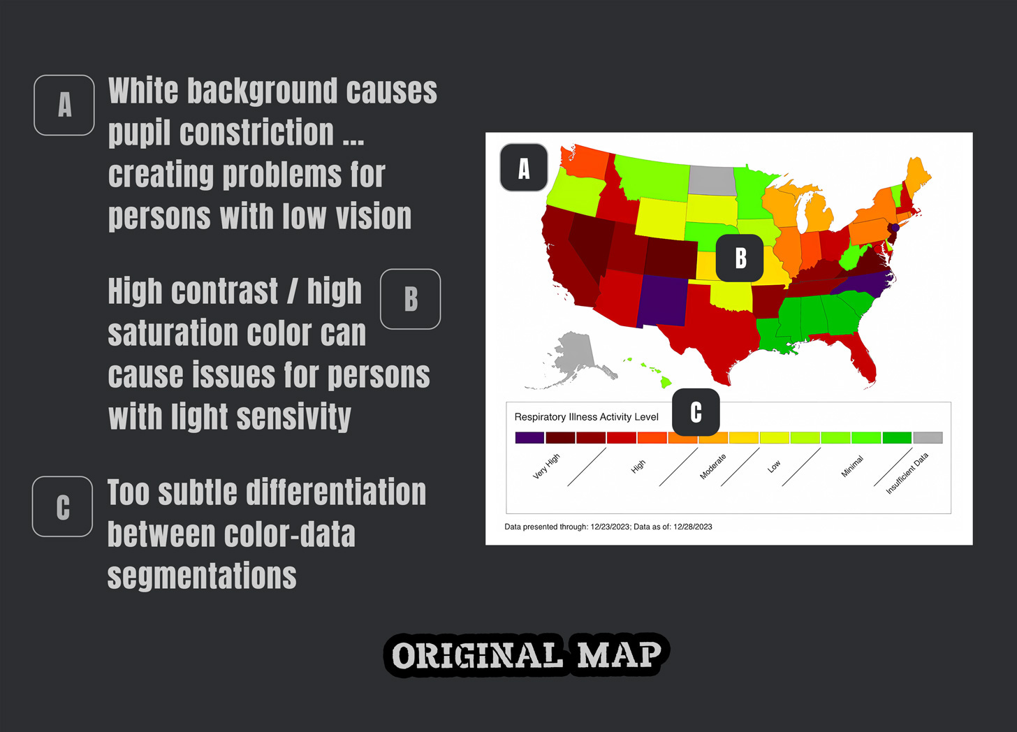
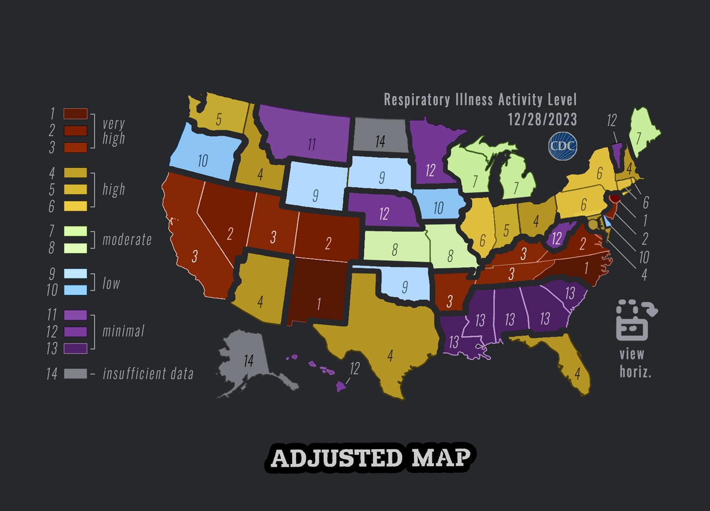
Center for Disease Control maps delivering health data such as Covid and Respiratory illness drive both personal and policy decisions. The map image I’m going to break down in this post was embedded in hundreds, maybe thousands of health, wellness, and government websites. It’s important information that has the potential to save lives. And that’s why it’s important for them to be accessible to the 40% of the population living with vision deficiencies.
This case study will demonstrate the application of universal design to thematic maps with the aim to maximize access both quantitatively and qualitatively for everyone.
Here are the hurdles many persons must jump over when trying to access the data contained in this map, and how designing for a wide spectrum of sight abilities, by integrating multiple modes of access, can offer solutions…
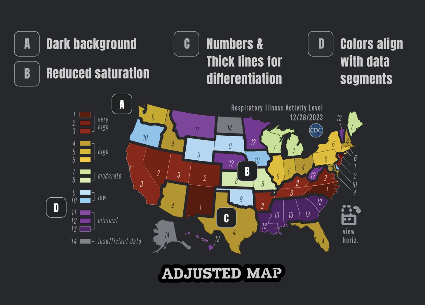
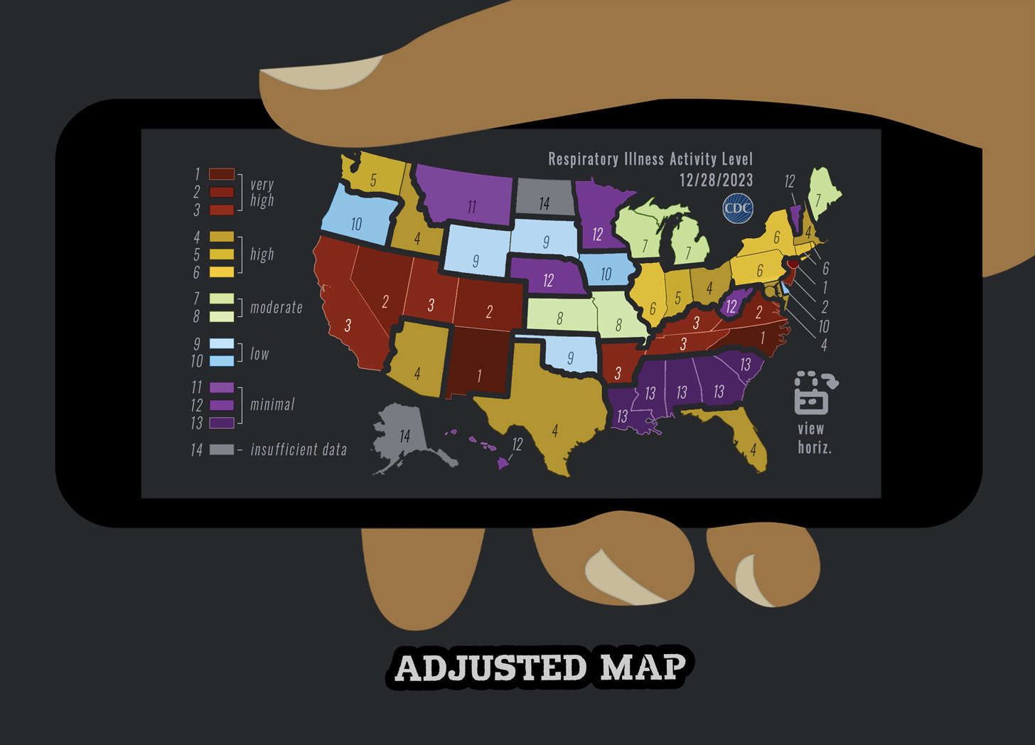
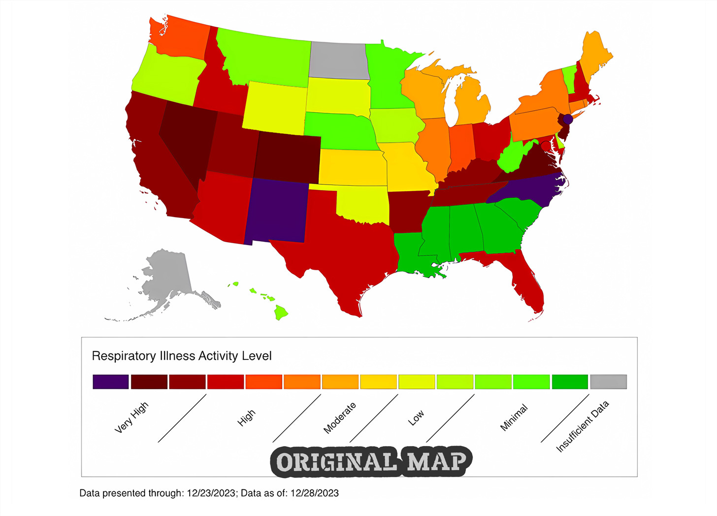
▶ The vast white background causes pupil constriction, creating problems for persons with low vision ... ✔Solution: easily solved with a dark background.
▶ High contrast / high saturation can cause issues for persons with light and scotopic sensitivity (including persons with intermittent migraine) ... ✔Solution: color can be limited to the less saturated CMYK color space, and contrast maxed out at a 12:1 ratio.
▶ Overly subtle differentiation between color-data segmentations is hard to parse in high light and glare situations on our phones and in low room lighting with printed versions, especially for persons with most types of low vision ... ✔Solution: increase the text and outline color values to meet the WCAG minimum 4.5:1 contrast requirement.
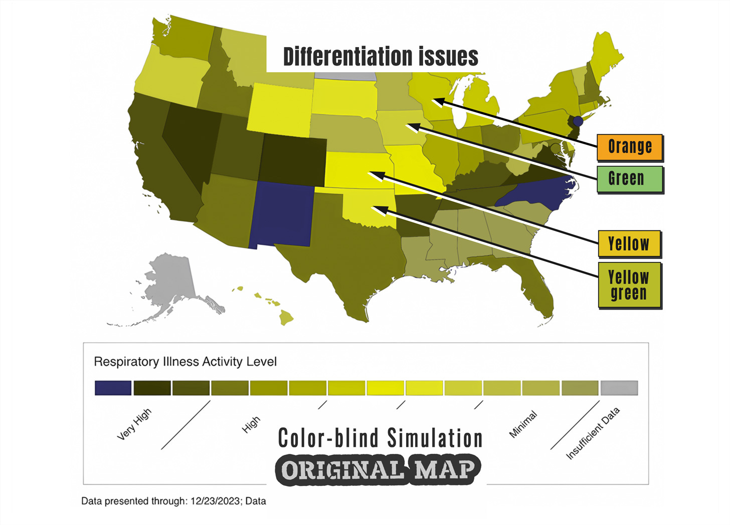
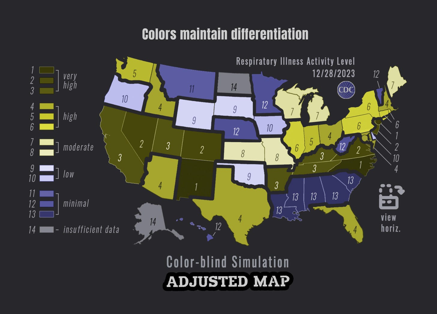
▶ Colors don’t differentiate well with data segments (high, moderate, etc.) ... ✔Solution: add thick lines between regions, reorganize the color hues, and increase the color value range (light to dark).
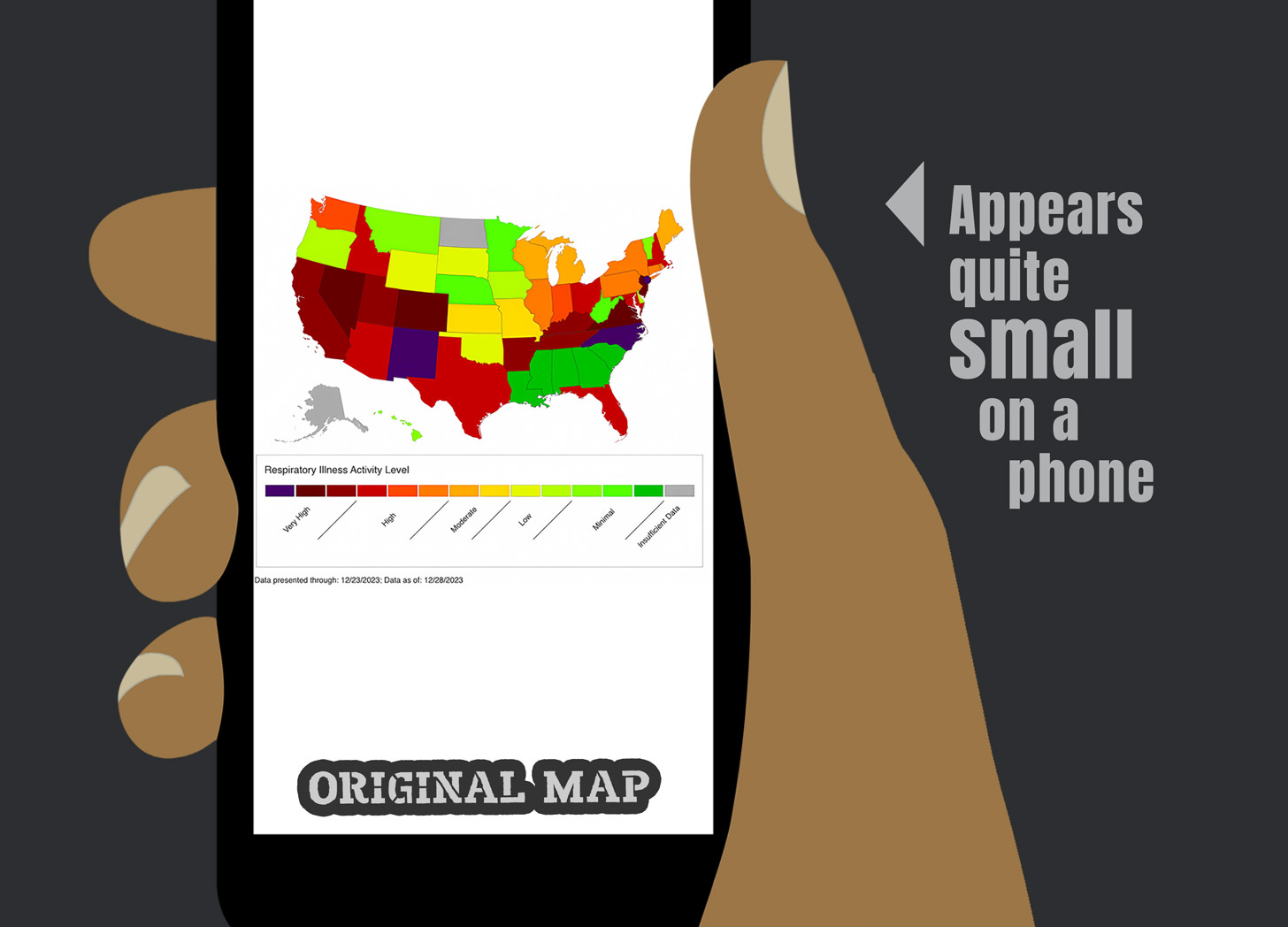
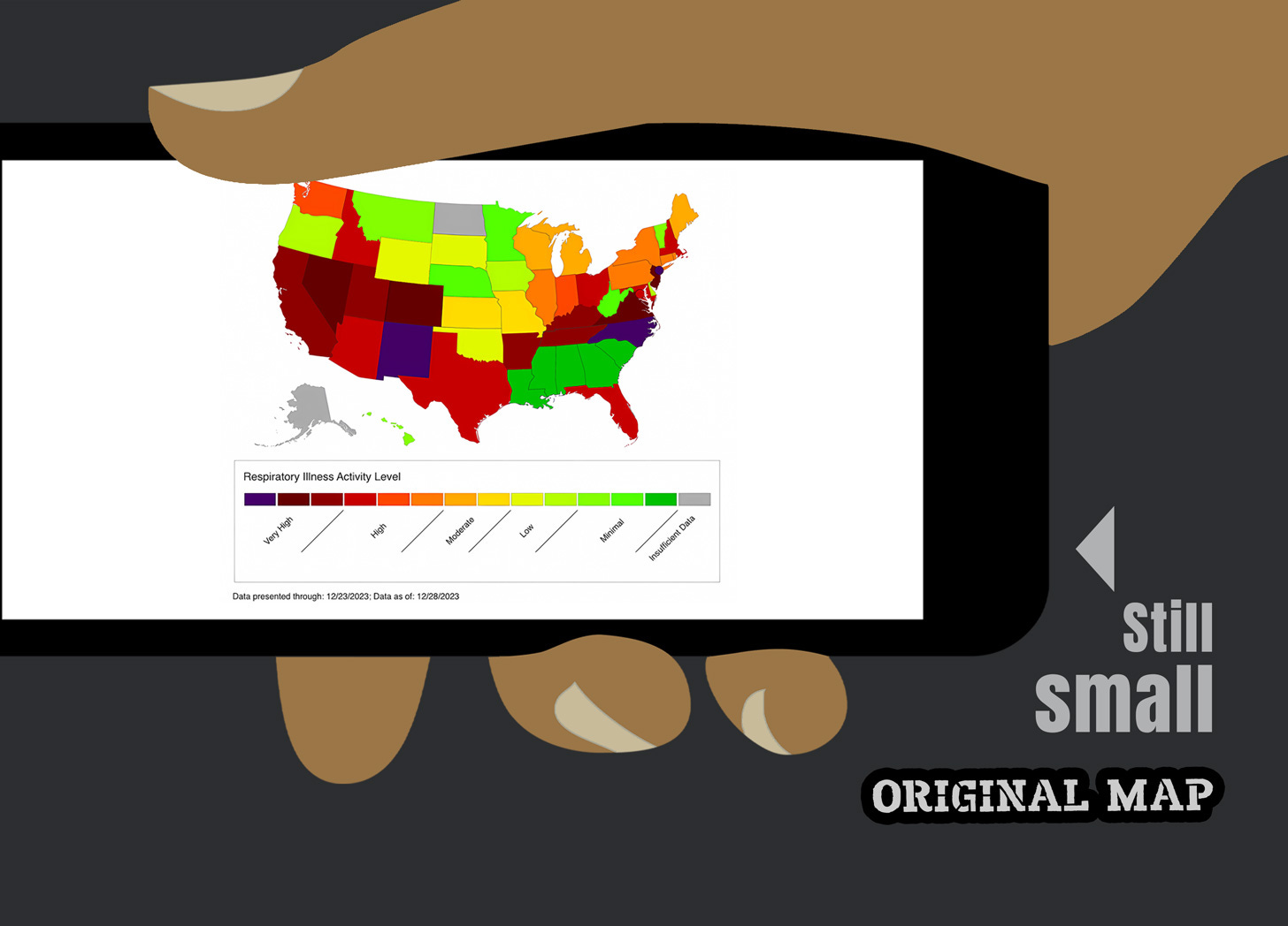
▶ The image is too small when viewed on a phone ... ✔Solution: reformat the composition into a horizontal orientation and increase the text size. Ensure that pinch zoom is available when embedded on mobile devices.
▶ Poor color differentiation for color-blind persons ... ✔Solution: add correlation numbers and utilize colors that translate well for red-green color-blindness (99.999% of the cases). For rare blue-colorblind and no-color-vision persons, my proposed scheme has improved efficacy over the original, and they also have the numbers as a fallback.
▪ Note: there should be an additional mode of access in the form of a text-only list of the data included on the page for persons with severe low vision, blindness, motor control, and other disabilities that could preclude them from engaging with an image.
Get these posts directly in your email inbox by subscribing to my free Substack newsletter …
#a11y #userexperience #graphicdesign


