


Mattel’s recent color-blind fix for Uno has a fatal flaw
It follows the unfortunate accessible-design trend of applying band-aids to flawed products without employing universal design.


Universal design demands that solutions for persons with deficiencies and disabilities be developed whole-cloth from a robust user experience development process. So let’s try that that for this UNO game color-blind facilitation.

With Mattel’s new design, colors are identified for color-blind persons using symbols located at the top center of each card: triangle for green, star for yellow, circle for red, square for blue.

This works great for color-blind persons …

… Unless they have numerous cards in their hand. In which case, the symbols are covered up.
Universal design demands that solutions for persons with deficiencies and disabilities:
Harmonize accessibility and aesthetics seamlessly.
Prioritize abilities over disabilities.
Facilitate shared experiences between typical and disabled persons.
Provide a qualitatively equal experience for everyone.
Don’t stigmatize.
My proposed universal design solution:

Position the symbols in the upper left corners so they are unlikely to be covered up by adjacent cards.

Lighten the green and darken the red, which enhances the contrast differentiation between them for 99.999% of color-blind persons (those with the red-green variety).
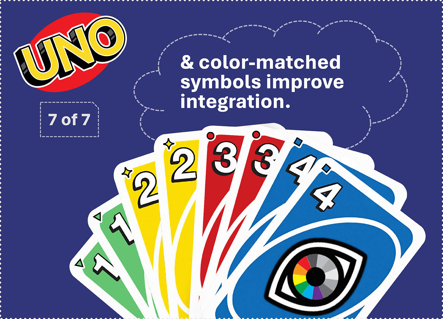
Add color to the symbols (matching the card colors) so they integrate, harmonize, and destigmatize.
Get these posts directly in your email inbox by subscribing to my free Substack newsletter …