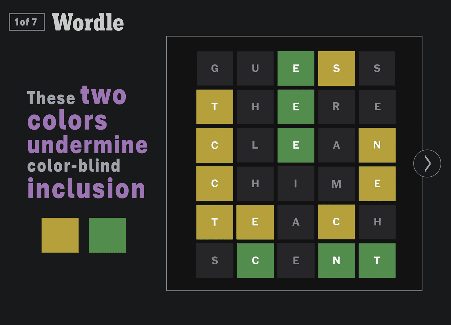
These 2 Wordle colors undermine color-blind inclusion.
It’s only Wordle. Why can’t color-blind persons just find a different hobby? Why spend time and treasure making trivial pursuits like Wordle accessible?
This logic would require media producers, product manufacturers, and built environment developers to draw lines of accommodation that delineate levels of participation. Above the line: important enough to design and build-in accessibility. Below the line: not important enough to expend the effort.
But who’s going to determine where these lines lie? What would be excluded and for whom? What are the criteria that would drive these decisions?
It’s actually easier and better design citizenship to apply accessible design to everything. To implement a single inclusive design strategy and workflow for every project. And stop spending time and treasure trying to make decisions about who we are going to exclude.
Wordle has added a “high contrast” mode that converts the yellow and green to orange and blue. Color-blind users would have to know to click the gear, find the “high contrast mode” toggle button, read the fine print underneath that indicates it’s for color-blind persons, then toggle it on, then click the question mark icon to find out what the colors mean. That’s the kind of sub-par accessible design UX that’s all too common.
Universal design demands that we make popular games like Wordle function for persons of every vision ability so they can fully participate in the mainstream cultural fabric of the world in which they live without having to engage with clumsy alternate versions.
Here’s the Wordle color issue, In summary:
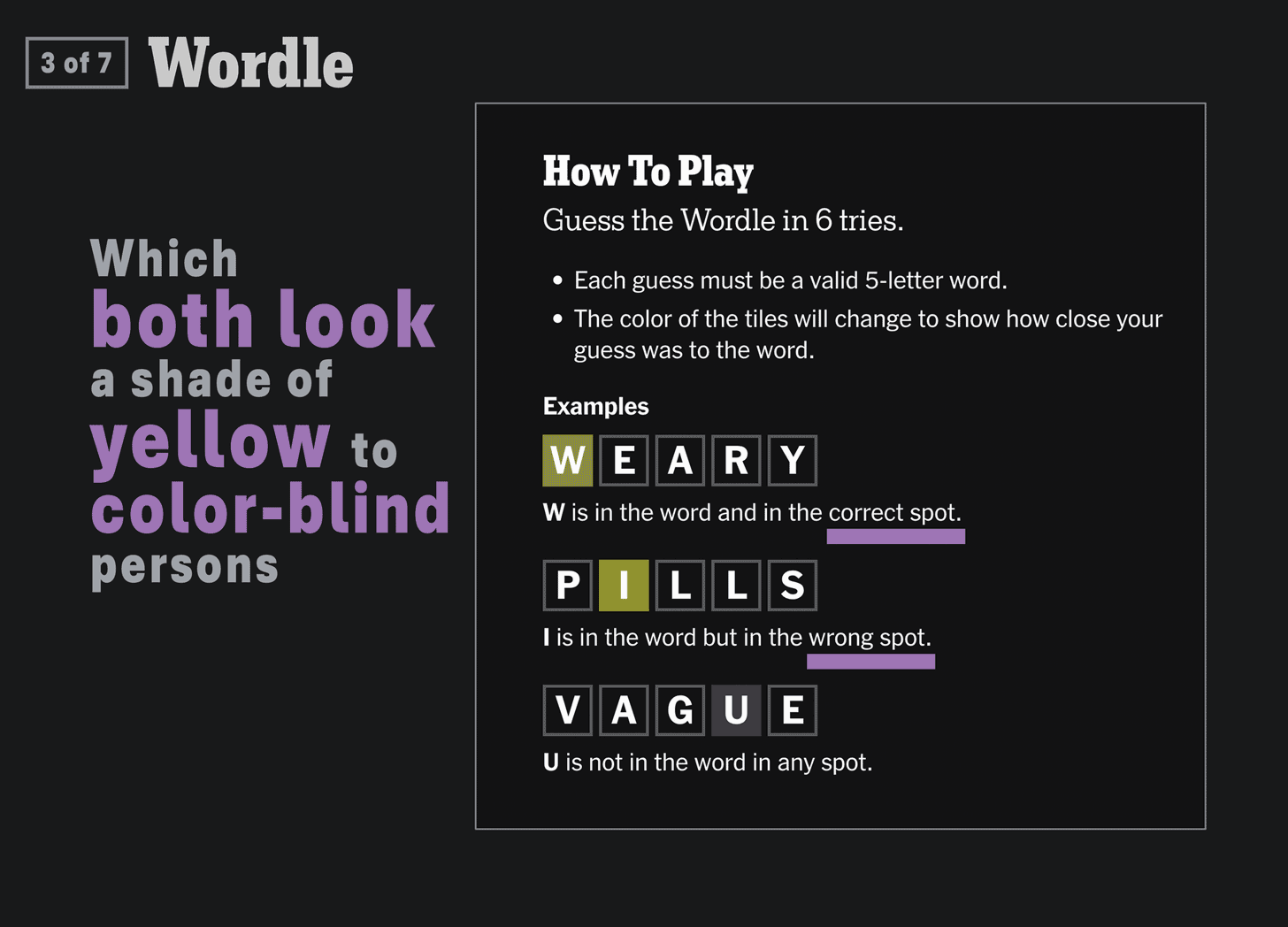
1 - Correctly guessed letters are denoted using green and yellow. Green for letters that are in the word and in the correct spot. Yellow for letters that are in the word but in the wrong spot.
2 – Both green and yellow letters look a slightly different shade of yellow to color-blind persons.
3 - When only one is visible ...
4 - it’s hard to know which one it is.
5 - changing one to a cool, blue color
6 - Fixes the issue
Shout-out to color-blindness advocate Peter Woolford, for alerting me to this color-blind dilemma!
Get these posts directly in your email inbox by subscribing to my free Substack newsletter …


